
modern entryway layout can set the tone for your home — a few right colors make an ordinary hall feel inviting or boldly modern. Want palettes that match your light, floor, and furniture? These 11 options give clear, practical starting points you can test this weekend.
How lighting and entry size shape palette choices
Lighting and entry size change how colors look and feel. A narrow foyer with little natural light can feel closed with deep tones, while a roomy, sunlit entry can handle richer shades comfortably.
How natural and artificial light affect color
Natural light shifts through the day and changes a paint’s appearance. North-facing entries get cool, soft light and make cool colors look stronger. South-facing or west-facing entries get warm, bright light and lift warm hues. Artificial bulbs also matter: warm LEDs (around 2700K–3000K) soften colors; cool LEDs (3500K–5000K) make colors appear sharper. Test samples at different times to see true results.
Small vs large entries: scale and contrast
In small entries, use lighter, reflective colors to open the space. Low-contrast schemes—walls, trim, and ceiling in related tones—help the area feel seamless. For larger entries, consider bolder choices: a dark accent wall, two-tone schemes, or high-contrast trim to add drama without overwhelming scale.
Practical tips: testing, finishes, and pairing
Try three big swatches on the actual wall and view them in morning and evening light. Choose paint sheens with purpose: eggshell for walls, semi-gloss for trim to reflect light and resist scuffs. Coordinate palette with floors and hardware—warm wood pairs well with warm neutrals; cool stone and tile suit muted blues and grays. Add layered lighting (overhead, wall, and task) to control mood and reveal true color.
- Place samples next to flooring and under lighting you use daily.
- Use a small accent color for doors or a console to test contrast before committing.
- Consider texture—rugs and wood tones shift how a color reads.
11 palette examples with moods and material pairings

Use these 11 palettes to match a mood and the materials in your entry. Each option names the main tones and suggests floors, hardware, and textiles to pair.
Palette examples with moods and material pairings
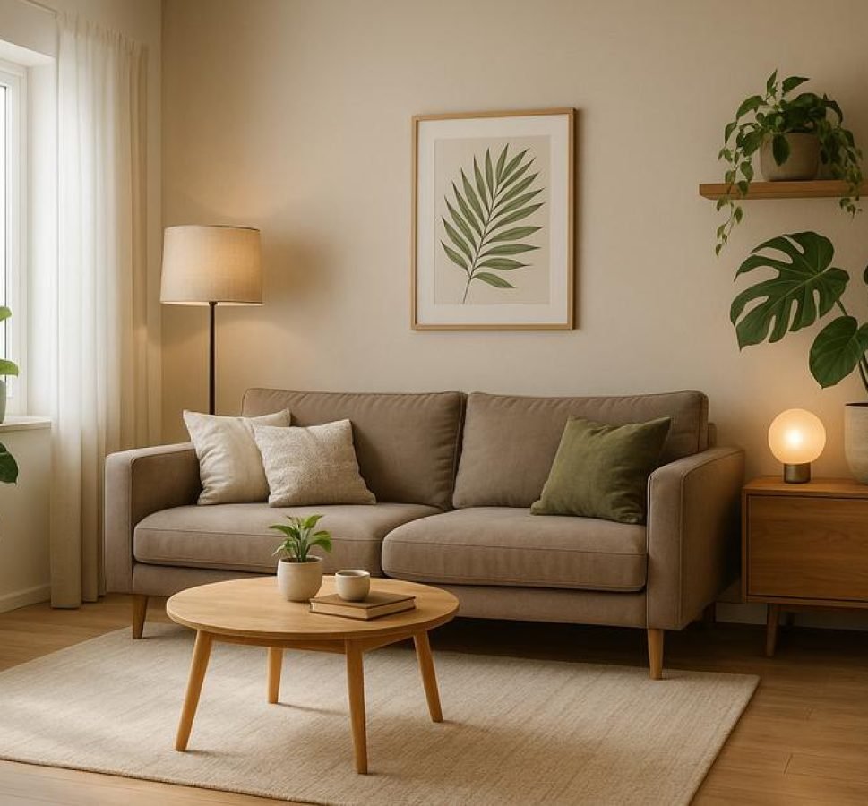
- Soft warm neutrals: Mood: calm and welcoming. Pair pale beige walls with light oak floors, brass hardware, a woven rug, and a linen bench.
- Cool gray and slate: Mood: modern and crisp. Pair medium gray paint with slate tile, chrome or stainless fixtures, a geometric wool rug, and glass lighting.
- Muted teal and sand: Mood: relaxed and coastal-modern. Pair muted teal accent wall with sand-toned tile, rattan baskets, matte-black hooks, and natural fiber runner.
- Deep charcoal and brass: Mood: dramatic and sophisticated. Pair charcoal walls or a door with honed marble or dark wood floors, brass hardware, and a leather bench for contrast.
- Dusty blue and oak: Mood: soft and classic. Pair dusty blue walls with warm oak floors, matte-black or aged bronze fixtures, linen textiles, and a round mirror.
- Terracotta and olive: Mood: earthy and cozy. Pair terracotta accent pieces with olive walls or plants, reclaimed wood console, woven rugs, and matte-black metal accents.
- Monochrome black and white: Mood: minimal and bold. Use crisp white walls, black trim or door, concrete or light tile floor, black metal hooks, and a textured gray rug.
- Blush pink and warm gray: Mood: soft and modern. Pair blush accents with warm gray walls, brass hardware, light wood furniture, and plush textiles to soften the space.
- Moody navy and walnut: Mood: rich and welcoming. Pair navy walls with walnut floors or bench, leather seating, warm brass lighting, and a patterned runner.
- Soft sage and limestone: Mood: calm and natural. Pair sage walls with pale limestone or concrete tile, matte-black hardware, woven baskets, and a sisal rug.
- High-contrast minimal: Mood: sleek and architectural. Pair matte-black accents with crisp white walls and natural wood floors, black steel hardware, and minimal decor for strong lines.
Quick pairing tips: match warm woods with warm-toned palettes and stone or concrete with cool palettes; test a large swatch near your floor and under real light before committing.
Practical tips for painting, trim, and accent colors
Treat walls, trim, and accents as one coordinated plan. Choose the main wall color first, then pick trim and an accent that support it.
Test in place
Paint large swatches (at least 2 feet) on the actual wall. Check them in morning and evening light and next to your floor and furniture.
Choose finishes with purpose
Use eggshell or matte for walls to hide minor flaws. Pick satin or semi-gloss for trim and doors to resist scuffs and reflect light. Semi-gloss trim creates clean, durable edges.
Balance contrast and scale
Low contrast (trim close to wall tone) makes small entries feel seamless. High contrast adds drama in larger spaces—try a dark door or bold trim for impact.
- Apply the 60/30/10 rule: 60% main color, 30% secondary, 10% accent.
- Use an accent color on the door or a single wall to test bolder hues before committing.
- Match hardware finish to the palette—warm metals with warm tones, matte black or chrome with cool tones.
- Protect high-traffic zones with washable finishes or semi-gloss on lower walls.
Practical sequence: paint walls first, then trim for cleaner lines; test samples near lighting and flooring; and try a small, removable accent before a full repaint.
Mixing textures and finishes to elevate a modern entryway

Texture and finish turn a simple entryway into a layered, tactile space. Use contrasts—soft textiles against hard surfaces—to add depth without clutter.
Key textures and where to use them
- Wood: warm oak or walnut for benches, consoles, and floors to add warmth.
- Metal: brass or matte black for hardware and lighting to create crisp details.
- Stone or tile: honed or concrete-look tile for durable, textural floors near the door.
- Textiles: wool or natural-fiber rugs and linen cushions to soften hard lines.
- Leather and woven: leather bench seats or rattan baskets for tactile contrast and storage.
How to combine finishes
Pick one dominant texture, one supporting, and one accent. For example, oak floors (dominant), a wool runner (supporting), and brass hooks (accent). Keep metal finishes limited to one or two types to avoid visual noise.
Practical tips for balance and durability
- Mix matte and subtle sheen: matte walls, satin trim, and semi-gloss on doors for clean edges.
- Use rugs to protect floors and tie colors and textures together.
- Choose finishes that stand up to traffic—semi-gloss trim and durable rugs in high-use zones.
- Test textures in your space: touch samples and view under your lighting.
Lighting reveals texture: layered light (overhead, wall, and task) highlights finishes and changes the mood. Aim for a mix of warm and neutral light to show true materials.


