
Boho nursery color palette can turn a bland room into a warm, layered haven without fuss. Want quick pairings and styling tips you can actually use? Here’s a short guide with simple combos and placement tricks.
Choosing a base palette: neutrals and accent hues
Start with a calm, versatile base to let accent hues shine. Neutrals set the mood and make a small nursery feel airy and cozy. Ask which emotion you want — tranquil, warm, or playful — then pick undertones that match.
Key neutrals and why they work
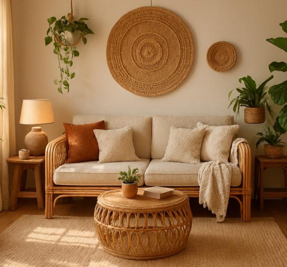
Choose from warm beige, creamy off-white, soft gray, or light taupe. These colors hide marks, reflect light, and blend with wood and woven textures. Warm neutrals pair well with terracotta and mustard; cool neutrals suit sage and dusty blue.
Accent color choices and balance
Pick one or two accent hues to add personality. Use the 60-30-10 rule: 60% base neutral, 30% secondary color in larger elements, 10% bold accent in small decor. This keeps the scheme balanced and kid-friendly.
- Primary accent: a soft, muted tone (sage, dusty rose) for bedding or a rug.
- Secondary accent: a deeper shade (terracotta, mustard) for pillows or a wall niche.
- Tiny pops: navy or ochre in mobiles, frames, or toys.
Materials and texture to enhance color
Layer natural materials to make color read richer: oak furniture, rattan baskets, cotton and linen textiles, and a wool or jute rug. Textures break up flat areas and let muted accents feel lively without overwhelming the space.
Quick combos to try
Try these easy pairings: cream + sage + terracotta, warm beige + dusty rose + mustard, or soft gray + navy + terracotta. Each combo works well with wood tones and woven accents for a cohesive boho nursery.
Want to test colors fast? Paint peel-and-stick samples on one wall or style a corner with textiles first. Small tests save time and help you feel confident about the final palette.
Mixing textures and materials to amplify color depth

Layering textures makes colors read richer and more natural. Start with a smooth neutral wall, then add tactile pieces to catch light and shadow. Soft textiles like linen and cotton calm colors, while wool and jute add depth and warmth.
How textures change color perception
Matte, porous surfaces tend to mute hues and feel cozy. Shiny or glazed finishes brighten a shade and make it pop. Mixing both gives a subtle contrast that keeps a palette interesting without overwhelming a small room.
Practical layering tips
Limit main textures to three types so the space stays calm. Repeat one texture in at least three places (for example, a rattan lamp, a basket, and a shelf accent) to tie the room together. Vary pattern scale: pair a large woven rug with small patterned cushions for balance.
- Place heavier textures low (rug, pouf) and lighter textures higher (macramé, curtains) to ground the room.
- Contrast smooth and rough: a matte painted wall beside a woven wall hanging adds depth.
- Keep crib textiles simple and secure: choose tightly woven fabrics and avoid loose fibers near baby’s sleep area.
Materials that amplify boho color depth
Choose natural materials: oak or birch furniture, rattan baskets, jute or wool rugs, linen curtains, and cotton bedding. Add ceramics or unglazed terracotta for earthy accents and a touch of clay warmth. Metallics should be minimal—brass or brushed gold in small decor pieces works well.
Test combinations in a small vignette before committing: lay a rug sample, drape a throw, and place a basket together. Seeing textures side by side helps you judge how colors and materials interact in real light.
Paint placement and focal points: where to add accent shades
Use paint to create a clear focal point without crowding the room. Think about where the eye naturally lands and place color there: behind a crib, a reading nook, or a play corner.
Accent wall options that work
An accent wall is the easiest move. Paint one full wall in a muted accent shade to anchor the space. If a full wall feels strong, try a painted arch, a half wall, or a lower board-and-batten color block.
- Half wall or wainscoting: paint the bottom 1/3 to 1/2 in an accent to ground furniture.
- Arched niche or panel: adds a soft focal point without overpowering the room.
- Ceiling accent: a subtle color on the ceiling can make the room feel cozy and unique.
Where to place small accents
Use smaller paint areas for pops of color. Paint a door, window trim, or a recessed shelf in an accent shade. These small areas follow the 60-30-10 balance: majority neutral, one larger accent, and small bright pops.
Paint patterns and scale
Keep patterns simple. Wide horizontal stripes make the room feel wider. A single vertical stripe or painted panel can draw the eye up. Stay with large, calm shapes rather than many tiny patterns to avoid visual clutter.
Use the accent color on items that already draw attention, like a rocking chair alcove or a gallery wall. This ties functional spots to the palette and creates purposeful focus.
Practical tips and safety
Always choose low-VOC, non-toxic paint for nurseries. Test paint samples on different walls and view them at morning and evening light. Place samples at eye level and live with them for a few days before committing.
- Keep painted areas away from direct crib contact if paint finish isn’t fully cured.
- Use painter’s tape for crisp lines and simple shapes.
- Coordinate painted focal points with textiles and natural materials to keep a cohesive boho vibe.
When in doubt, style a small vignette: lay a rug, add a chair and a painted sample behind them. Seeing the full scene helps decide where accent shades should live.
Affordable sourcing and DIY decor to complete the look

Smart sourcing and simple DIY make a boho nursery look curated without the high price tag. Focus on one or two standout pieces and fill the rest with affordable accents that match your palette.
Where to shop for budget finds
- Thrift stores and flea markets: hunt for solid wood furniture you can sand and repaint.
- Online marketplaces and local groups: filter by pick-up and inspect photos for wear.
- Discount home stores and outlet sections: find textiles and baskets at lower cost.
- Swap or borrow: trade items with friends for temporary needs like baby gear.
Simple DIY projects that read high-end
Small upgrades make thrifted items feel intentional. Try repainting a dresser in a muted accent shade, replacing knobs with simple brass or wooden pulls, or adding a painted arch behind a crib. Handmade textiles—like a sewn crib skirt or a sewn cushion cover—add polish with little expense.
- Macramé wall hanging or shelf plant hanger—easy starter kits are inexpensive.
- Paint-dipped baskets or ombré small table for cohesive accents.
- Stenciled pillows or a simple woven garland to tie colors together.
Materials and tools to keep on hand
Stock a small kit: sandpaper, low-VOC paint, foam brushes, simple hand tools, and a hot glue gun. These let you refresh many pieces quickly. Use washable, durable fabrics for items that will face wear.
Styling and safety tips
Style in vignettes: place a basket, a plant, and a folded throw together to preview the look. Keep safety first—anchor furniture to the wall, choose non-toxic paints, and avoid loose fibers near the crib. Test samples and live with them for a few days before finishing a larger DIY so color and texture work in real light.
- Coordinate thrifted pieces by repainting or swapping hardware for a cohesive finish.
- Limit small decor near sleepers; choose washable, tightly woven textiles.
- Budget by prioritizing one investment piece and filling in with DIY or thrifted accents.


