
Nature inspired colors use hues found in the outdoors like greens, blues, earth tones, and warm accents to create calming, balanced, and inviting spaces that connect your home with the natural world.
Have you ever noticed how nature inspired colors can instantly change the vibe of a room? These palettes pull from earthy greens, warm browns, and soft blues that make your space feel alive yet peaceful. Want to see how to use them in your home? Let’s dive in.
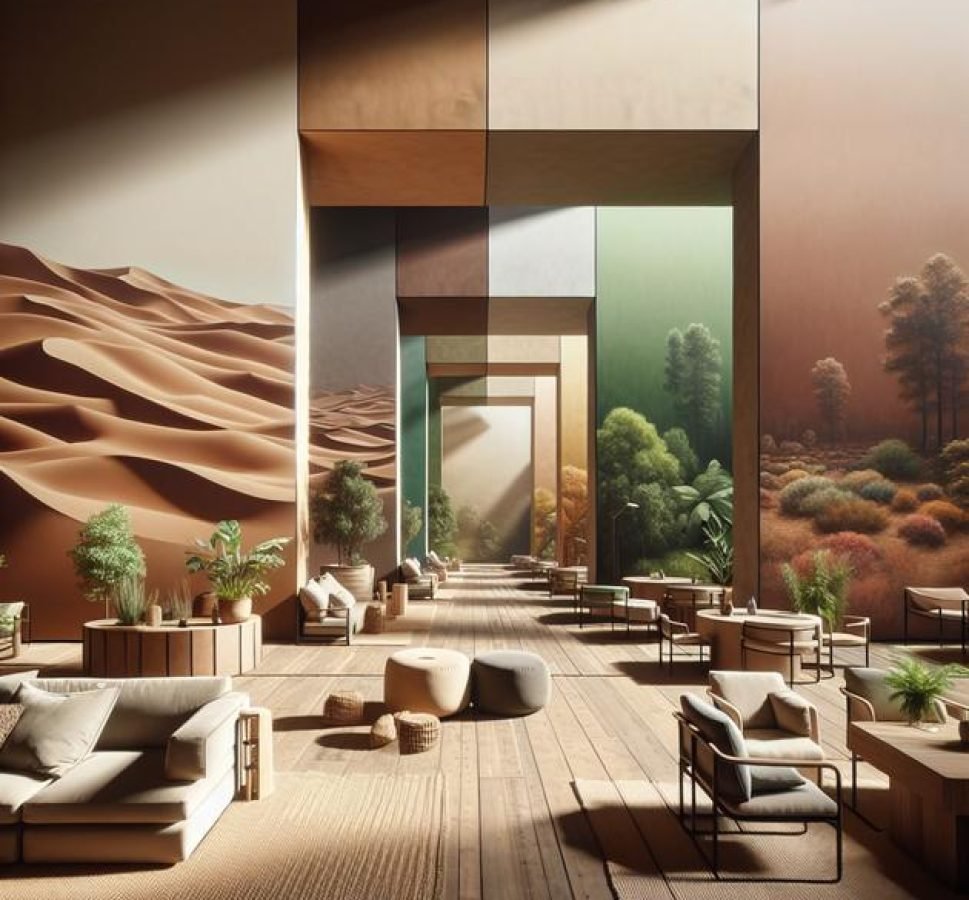
understanding nature inspired colors
Nature inspired colors come from the hues found in our natural environment. These include shades of green from leaves and moss, earthy browns from soil and tree bark, calming blues from the sky and water, and soft neutrals like sand and stone. Understanding these colors means recognizing how they evoke feelings of peace, balance, and warmth.
Each color in a nature inspired palette carries its own mood. For example, greens often represent growth and tranquility, while warm browns create a sense of stability and comfort. Blues tend to soothe and refresh, mimicking clear skies or gentle waves. Neutrals provide a grounding backdrop that pairs well with brighter or deeper tones.
By connecting colors to natural elements, you can create spaces that feel inviting and harmonious. This connection also makes color choices more intuitive, as you draw inspiration directly from nature’s variety and subtlety.
When selecting colors for your home, think about how these shades work together to reflect the seasons, landscapes, or outdoor scenes you love. Using nature inspired colors is not just about copying green or brown, but about evoking the energy and calmness that nature effortlessly provides.
how to choose the right palette for each room
Choosing the right color palette for each room depends on the room’s purpose, lighting, and your personal style. Nature inspired colors offer a wide range of options that can help you create different moods throughout your home.
Consider the Room’s Purpose
For calm and restful spaces like bedrooms, go for soft greens, blues, or muted earth tones. These shades mimic natural elements like leaves and water, creating a soothing environment. In contrast, living rooms and kitchens often benefit from warmer tones such as rich browns, deep oranges, and warm neutrals to promote comfort and energy.
Assess Natural and Artificial Lighting
Light affects how colors appear. Rooms with ample natural light can handle deeper, richer nature inspired colors without feeling dark. For spaces with limited light, lighter shades like sandy beiges, soft moss greens, or pale blues can help brighten and open up the area.
Match with Existing Elements
Look at your furniture, flooring, and décor when selecting your palette. Woods and natural materials pair beautifully with earthy colors. Using a combination of colors that reflect natural textures can provide a cohesive and inviting feel.
Balance and Accent
Use a primary nature inspired color as the base, then add accents in complementary shades found in nature, like a soft sky blue with warm sunset orange accents. This balance of hues enhances interest without overwhelming the space.
By thoughtfully choosing palettes based on the room’s function and lighting, you create spaces that feel both beautiful and in harmony with nature.
combining earth tones with bright accents
Earth tones like warm browns, rich terracotta, and soft beige create a cozy and natural backdrop. To add energy and interest, bright accents such as mustard yellow, vibrant turquoise, or fiery coral work beautifully. This combination reflects the balance found in nature between grounded elements and pops of life.
Using Earth Tones as a Base
Start with walls, furniture, or floors in muted earth tones. These shades give a solid, calming foundation that feels warm and inviting. Earth tones are versatile and blend well with many textures, like wood, stone, and natural fabrics.
Adding Bright Accents
Bright accents should be used thoughtfully to highlight details and create focal points. Consider throw pillows, artwork, rugs, or decorative objects in bold colors. For example, a deep brown sofa paired with bright turquoise cushions creates a lively yet balanced look.
Playing with Proportions
Keep most of the room in earthy hues and reserve smaller areas for bright colors. This approach maintains harmony while preventing the space from feeling too loud. Using bright accents in accessories also makes it easy to update the room seasonally or with changing tastes.
Combining earth tones with bright accents lets you enjoy a space that feels natural and warm but also fresh and full of personality.
bringing greenery indoors with color

Bringing greenery indoors with color means using shades that remind us of plants and natural foliage to create a fresh, lively space. Green tones vary widely—from soft sage to deep forest green—each setting a different mood. These colors can make any room feel more connected to nature.
Choosing the Right Green Shades
Soft greens like mint or sage work well in bedrooms and bathrooms to promote calmness. Darker greens bring richness and depth, perfect for living rooms or libraries. Mixing different greens with other nature inspired colors adds complexity and interest.
Pairing Green with Natural Elements
Combine green walls or accents with wooden furniture, clay pots, or stone details to enhance the natural feel. Adding real plants boosts the effect, but even green textiles or artwork can simulate the outdoors inside.
Using Greenery as a Color Accent
You don’t have to paint the whole room green. Use cushions, rugs, curtains, or even small decor items in green tones. This approach is perfect for those wanting to add life and energy without overwhelming a space.
Integrating greenery colors indoors creates a soothing environment that feels both fresh and vibrant, echoing the outdoors in subtle and inviting ways.
using blues and greens for calm spaces
Using blues and greens together in a room is a great way to create a calming and peaceful space. Blue often reminds us of the sky and water, promoting relaxation and clarity. Green brings in the freshness of plants and trees, encouraging balance and harmony.
Choosing the Right Shades
Lighter blues like sky or powder blue pair well with soft greens such as sage or mint for a gentle, airy feel. For a richer atmosphere, deeper navy blues combined with hunter or forest greens add depth while maintaining calmness.
Balancing Colors
To avoid overwhelming the space, use one color as the dominant shade and the other as an accent. For example, paint walls in a soft blue and add green throw pillows, rugs, or plants. Natural materials like wood or linen also work well with this palette, enhancing the serene effect.
Why These Colors Work
Both colors are cool tones, which naturally reduce stress and encourage peace. They reflect elements of nature we associate with comfort and rest. Using blues and greens together helps create rooms perfect for bedrooms, bathrooms, or meditation spaces.
This thoughtful use of colors can transform any space into a calming retreat that feels both fresh and restorative.
warm colors from sunsets and autumn leaves
Warm colors inspired by sunsets and autumn leaves include shades of orange, red, gold, and deep amber. These hues bring a sense of coziness and warmth to any room. They mimic the natural transitions of the sky at dusk and the vibrant colors of fall foliage, adding energy and comfort.
Using Warm Colors Effectively
Choose rich oranges and reds for accent walls or décor items to make spaces feel inviting. Gold and amber tones work well on accessories, lighting fixtures, or fabrics like pillows and curtains. These colors naturally draw attention and can highlight key areas of a room.
Blending with Nature Inspired Neutrals
Pair sunset colors with neutral shades like beige, taupe, or soft browns to balance intensity and create harmony. This blend mimics the natural layering seen outdoors, such as leaves on soil or sunlight filtering through trees.
Creating Atmosphere with Warm Colors
Rooms like living areas and dining rooms can benefit from this palette, making them feel cozy for family gatherings or relaxing evenings. Using warm colors from sunsets and autumn leaves adds a natural warmth that lifts the mood without overwhelming the senses.
Through careful selection and balance, these colors bring the beauty and comfort of nature’s most vibrant moments indoors.
mixing neutrals from rocks and sand
Mixing neutrals inspired by rocks and sand creates a soothing and versatile palette. These colors include soft grays, warm taupes, sandy beiges, and gentle creams. Together, they form a calm foundation that complements a variety of styles and other color accents.
Choosing Neutral Shades
Look for colors that mimic natural elements like smooth stones, sandy beaches, and riverbeds. These hues often have subtle undertones of pink, yellow, or gray, giving them depth and warmth.
Combining Neutrals for Texture and Interest
Layer different neutral shades to add dimension and avoid a flat look. For example, pair a warm beige wall with light gray furniture and taupe accessories. Mixing textures like linen, wood, and stone further enhances this natural feel.
Using Neutrals as Backdrops or Highlights
Neutrals work well as base colors for walls, floors, or large furnishings. They also serve as perfect backdrops to showcase more vibrant nature inspired colors such as greens, blues, or warm accents. This balance keeps rooms feeling open and relaxed.
Mixing neutrals from rocks and sand helps create timeless, elegant interiors that feel grounded and inviting.
creating depth with shadow-inspired hues

Shadow-inspired hues are deep, muted colors that mimic the subtle shades found in nature’s shadows. These include charcoal grays, deep blues, dark greens, and soft purples. Using these colors adds depth and dimension to your space, making rooms feel cozy and layered.
Choosing Shadow Hues
Opt for colors that are darker but not overpowering. These shades can act as grounding tones when paired with lighter nature inspired colors like soft beiges, greens, or blues.
Applying Shadow Colors
Use shadow-inspired hues on accent walls, cabinetry, or furniture pieces to draw the eye and create visual interest. They work especially well in rooms with good lighting to prevent the space from feeling too dark.
Balancing with Light Elements
Balance deep shadow colors with light textures and neutral shades. Combining soft linens, light wood tones, and reflective surfaces like glass or metals helps maintain brightness while enjoying the richness of shadow hues.
Incorporating shadow-inspired colors offers a sophisticated way to add character and warmth that reflects the complexity of natural light and shade.
balancing wood tones and wall colors
Balancing wood tones and wall colors is key to creating a harmonious and inviting space. Wood elements such as flooring, furniture, or trim can range from light pine to rich mahogany. Choosing wall colors that complement these wood tones enhances the natural warmth and texture of your room.
Matching Warm Wood Tones
For woods with warm undertones like cherry or oak, earth-inspired wall colors such as soft beige, muted gold, or gentle greens work well. These shades highlight the wood’s natural glow and create a cozy atmosphere.
Pairing Cool Wood Tones
Cooler woods like maple or ash match nicely with light grays, pale blues, or soft whites. These combinations give a fresh, clean look while keeping the natural beauty of the wood in focus.
Using Contrast for Impact
Dark wood tones such as walnut or mahogany can be balanced with lighter neutral walls to avoid heaviness. Conversely, light wood can be anchored by deeper wall colors like forest green or charcoal to add depth and interest.
Balancing wood tones and wall colors creates a well-rounded space that feels connected to nature and visually appealing. Remember to consider the room’s lighting and size when choosing combinations for the best results.
color palettes for bedrooms
Color palettes for bedrooms inspired by nature focus on creating a restful and soothing atmosphere. Soft greens, gentle blues, and warm earth tones are ideal choices as they evoke calmness and promote relaxation.
Soft Greens for Tranquility
Green shades like sage, moss, or olive connect your room with the outdoors. They bring a sense of balance and healing, making the bedroom feel peaceful and fresh.
Blues to Calm the Mind
Light blues and muted teals mimic the sky and water, calming the mind and encouraging restful sleep. Pair these colors with whites or soft grays for a clean, airy space.
Warm Earth Tones for Cozy Comfort
Warm browns, beiges, and sandy colors add coziness and warmth to your bedroom. Use these colors on walls, bedding, or furniture to create an inviting retreat.
Combining Neutrals and Accents
Neutral bases like soft grays or off-whites work well, allowing you to add accents in your favorite nature inspired colors. Use pillows, rugs, or artwork to introduce these hues without overwhelming the room.
Choosing the right color palette for your bedroom helps create a space that feels both restful and connected to nature, promoting better sleep and relaxation.
color schemes to energize living rooms
Color schemes that energize living rooms often draw from vibrant nature inspired colors like warm yellows, lively oranges, and bright greens. These shades bring life, positivity, and warmth to the heart of your home, making it a space for gathering and activity.
Using Warm Yellows and Oranges
Yellow hues, reminiscent of sunlight and marigolds, can brighten the space and uplift moods. Pairing yellows with fiery oranges creates a dynamic and inviting atmosphere that encourages energy and conversation.
Incorporating Bright Greens
Bright greens evoke fresh leaves and new growth. They add a revitalizing touch that complements the warm colors and brings a natural balance to the room. Greens can be introduced through accents like cushions, throws, or plants.
Balancing with Neutrals and Wood
To avoid overwhelming the senses, balance vibrant colors with neutrals such as soft beiges or light grays. Wood tones in furniture or flooring add warmth and earthiness, grounding the bright palette in nature.
Color schemes designed to energize living rooms actively combine bold, natural colors with calming neutrals for a lively yet comfortable environment.
inspiring kitchen palettes from nature

Kitchen palettes inspired by nature focus on colors that energize and create a welcoming atmosphere. Think of fresh herbs, ripe fruits, and natural wood elements to build your color scheme.
Fresh Greens and Herb-Inspired Shades
Greens inspired by basil, mint, and sage add freshness to kitchens. These shades create a clean and vibrant space that encourages healthy cooking and eating.
Warm Reds and Fruit Tones
Colors like tomato red, apple green, or pumpkin orange bring energy and warmth. Use these shades in accents like backsplashes, kitchenware, or decorative pieces to add cheer and vitality.
Natural Wood and Earth Tones
Pair nature-inspired colors with natural wood cabinets, butcher block countertops, or stone textures. This combination enhances warmth and brings a grounded feel to the kitchen.
Inspiring kitchen palettes from nature balance fresh, vibrant colors with earthy neutrals to create a lively, inviting cooking space that feels connected to the outdoors.
bathroom colors that evoke water and tranquility
Bathroom colors inspired by water and tranquility focus on cool blues, soft aquas, and gentle seafoam greens. These shades create a spa-like atmosphere that promotes calmness and relaxation.
Soft Blues and Aquas
Light blue tones mimic clear skies and calm waters, helping to soothe the mind. Aquas and mint greens bring an added freshness that evokes the feel of the ocean.
Reflective Surfaces and Light Neutrals
Pair these colors with glossy tiles, mirrors, and light neutral tones like sandy beige or crisp white. This combination enhances light reflection and adds to the airy, tranquil vibe.
Accents Inspired by Nature
Incorporate natural materials such as bamboo, pebbles, or driftwood to complement the color palette. These touches bring organic texture and complete the calming effect.
Using bathroom colors that evoke water and tranquility transforms this personal space into a refreshing retreat that feels both peaceful and rejuvenating.
using nature colors in small spaces
Using nature colors in small spaces can make these areas feel larger and more inviting. Soft greens, warm neutrals, and light blues reflect natural elements and create an open, airy atmosphere even in limited square footage.
Choosing Light and Soft Shades
Opt for pale greens like sage or mint, gentle blues, and warm beige tones. These colors reflect light and prevent small rooms from feeling cramped or dark.
Using Accents to Add Depth
Add depth and interest with darker nature tones as accents. For example, a small wall with deep forest green or rich terracotta can create a focal point without overwhelming the space.
Incorporating Natural Textures
Combine nature-inspired colors with textures like natural wood, wicker, or linen to bring warmth and dimension. These elements enhance the connection to nature and keep the space feeling calm and balanced.
Using nature colors in small spaces creates a serene environment that feels bright and spacious, maximizing comfort and style.
tips to refresh your space seasonally with color
Refreshing your space seasonally with color helps keep your home feeling vibrant and connected to nature’s changing moods. Each season offers unique palettes inspired by natural shifts in light, foliage, and atmosphere.
Spring: Fresh and Light
In spring, incorporate soft pastels and fresh greens. Light pinks, pale blues, and minty greens evoke blooming flowers and new growth. Use cushions, throws, or fresh flowers to add these colors easily.
Summer: Bright and Energetic
Summer calls for bold and lively colors like turquoise, sunny yellow, and coral. These hues bring warmth and energy, mimicking vibrant summer skies and blooming gardens. Consider artwork or accent rugs to introduce these tones.
Autumn: Warm and Cozy
Autumn palettes include warm earth tones such as burnt orange, deep reds, and golden yellows. These colors create a cozy, inviting atmosphere perfect for cooler months. Use blankets, candles, or textured pillows to update your space.
Winter: Cool and Calm
Winter invites cooler shades like icy blues, soft grays, and rich greens. These colors reflect frosted landscapes and evergreen woods. Decorate with plush throws, curtains, or ceramics in these tones to maintain tranquility indoors.
Seasonal color refreshes using nature inspired palettes create spaces that feel alive, welcoming, and in tune with the year’s rhythms.
Bringing nature inspired colors into your home
Using nature inspired colors can transform any room into a peaceful and inviting space. From calming blues and greens to warm earth tones and vibrant accents, these palettes help you connect with the beauty of the outdoors.
By thoughtfully choosing colors that match your room’s purpose and lighting, you create homes that feel balanced and cozy. Whether refreshing your space seasonally or mixing tones for depth and energy, these palettes offer endless possibilities.
Embracing nature inspired colors is an easy way to bring warmth, calm, and style to your home. Try incorporating these hues to enjoy a beautiful, natural vibe every day.


