
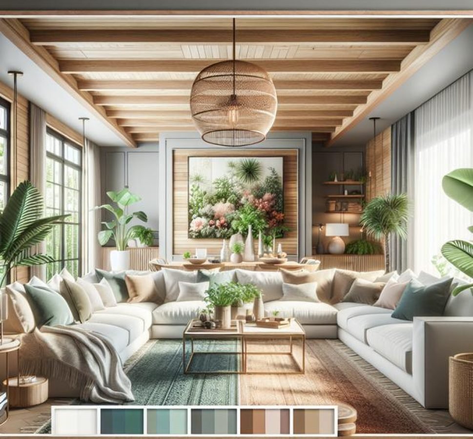
A living room color palette balances base, accent, and neutral shades considering room size, lighting, and mood, using color theory and psychology to create a cohesive, inviting, and adaptable space.
Ever wondered how a living room color palette can totally change the mood of your home? Picking the right colors feels tricky, but with some simple guidance, you might find yourself creating a space that feels just right. Let’s explore some fresh ideas that speak to your style and comfort.
understanding color theory basics
Color theory is the foundation for creating a living room color palette that feels balanced and appealing. It explains the relationships between colors and how they affect the mood of a space. The color wheel is a helpful tool that organizes colors into primary, secondary, and tertiary groups. Understanding these basics lets you mix and match colors with confidence.
The color wheel
The color wheel displays colors in a circle that shows how closely related they are. Adjacent colors are called analogous and usually create harmony when used together. Colors opposite each other are complementary and offer high contrast, adding energy to a space.
Warm vs. cool colors
Warm colors, like red, orange, and yellow, evoke comfort and coziness. Cool colors such as blue, green, and purple promote calm and relaxation. Combining warm and cool tones thoughtfully can shape how your living room feels.
Color harmony
Harmony means colors work well with each other, providing visual comfort. There are various schemes like monochromatic (using shades of one color), analogous, triadic (three colors evenly spaced on the wheel), and complementary. Selecting a harmonious palette is key to a cohesive living room design.
Using neutrals
Neutrals like gray, beige, and white are essential for grounding your palette. They provide a calm backdrop that helps brighter colors shine without overwhelming the senses.
how to choose the right palette for your room size
Choosing the right color palette for your living room depends heavily on the room’s size. Smaller rooms benefit from lighter shades that create an illusion of space and make the area feel airy and open. Colors like soft whites, pastels, and light grays reflect more light and prevent the room from feeling cramped.
Working with dark colors in small spaces
While dark colors can make a room feel smaller, using them as accents on one wall or in decor can add depth and coziness without overwhelming the space.
Large rooms offer more freedom
In contrast, larger rooms can handle richer, deeper color palettes. Bold colors like navy, emerald, or charcoal make the space feel warm and inviting. You can also use contrasting colors to define different areas within an open floor plan.
Considering ceiling height and natural light
Besides floor space, ceiling height and natural light impact your palette choices. High ceilings and abundant natural light allow for darker or more saturated colors, while lower ceilings with limited light work best with brighter colors to keep the room feeling spacious.
Balance and flow with adjoining rooms
Think about how your living room connects with other rooms. A harmonious color flow between rooms creates a cohesive look, so pick palettes that complement each other, keeping the overall feel balanced.
using neutrals for a timeless look
Neutrals are the backbone of a living room color palette that stands the test of time. Colors like beige, gray, white, and soft taupe create a calm and versatile backdrop that allows your furnishings and decor to shine. These shades aren’t just safe choices—they create a sophisticated foundation.
Why choose neutrals?
Neutrals work well with almost any accent color, making it easy to change your look with pillows, artworks, and accessories. They provide a balanced and cohesive feel that suits both modern and traditional styles.
Mixing different neutrals
Layering various neutral shades adds depth and interest to your living room. Combining warm beiges with cool grays can create contrast while maintaining harmony. Using different textures, such as a plush rug or linen cushions, enhances this effect.
Neutrals and light
Natural and artificial light play a big role in how neutral colors appear. Soft whites reflect light to brighten a room, while deeper grays absorb light and add warmth. Consider the lighting in your living room when choosing which neutrals to use.
Creating a timeless look
A neutral color palette adapts easily to new trends, so your living room won’t feel outdated quickly. It allows you to refresh your space with small changes instead of a full redesign.
adding accent colors without overdoing it

Adding accent colors to your living room color palette is a great way to bring life and personality into the space without overwhelming it. Accent colors work best when used sparingly, often in accessories like pillows, rugs, or artwork. This approach adds pops of interest and vibrancy while keeping the overall look balanced.
Choosing the right accent colors
Pick accent colors that complement your main palette. For example, if your living room is mostly neutral, bold shades like teal, mustard, or coral can add energy. If your base colors are cool tones, warm accents can create wonderful contrast.
Accent walls and furniture
Using an accent wall or a piece of furniture in a bold color can define the space and create a focal point. Just ensure it doesn’t clash with other elements. Stick to one or two accent colors to maintain harmony.
Using patterns and textures
Accent colors can also come through patterns or textured fabrics, like a colorful throw blanket or patterned curtains. These details enrich the room without adding solid blocks of color.
Balance is key
Remember, less is often more. Too many accents can make the space look busy and chaotic. Use accent colors to highlight rather than dominate, creating a cohesive and inviting living room.
playing with warm tones for coziness
Warm tones like reds, oranges, and yellows bring a sense of coziness and comfort to your living room. These colors can make the space feel inviting and intimate, perfect for relaxing or entertaining guests.
Using warm tones on walls
Painting walls in warm colors creates a rich backdrop. Soft terracotta or muted mustard can add warmth without overwhelming the senses. These shades create a perfect balance between vibrancy and calmness.
Incorporating warm textiles
Throw pillows, blankets, and rugs in warm hues help layer coziness. Fabrics like wool and velvet in burnt orange or deep reds add texture and invite you to sit and relax.
Lighting and warm colors
Warm lighting enhances the effect of warm tones. Use lamps with yellow or soft white bulbs to make colors glow and the room feel snug during evenings.
Balancing with neutrals and cool tones
To avoid overwhelming a room with warm tones, balance them with neutral or cool colors. Light grays, creams, or even touches of blue can keep the space feeling fresh while preserving warmth.
cool tones to create calm and serenity
Cool tones such as blues, greens, and soft purples are perfect for creating a calm and serene atmosphere in your living room. These colors are known to reduce stress and promote relaxation, making your space feel like a peaceful retreat.
Using cool tones on walls and furniture
Soft blues or gentle greens on walls provide a soothing backdrop that pairs well with neutral furnishings. Furniture upholstered in cool shades adds to the serene vibe without overpowering the room.
Combining cool tones with natural elements
Adding natural wood, plants, or stone textures complements cool colors beautifully, enhancing the feeling of tranquility. These elements bring warmth and life to the palette.
Layering with light and texture
Using different textures like smooth ceramics, soft fabrics, and glossy finishes creates interest while maintaining calmness. Light-colored cool tones reflect natural light to keep the room bright and airy.
Balancing with warm accents
To avoid a cold or sterile feel, incorporate small warm accents or metallic details. These touches provide contrast and make the space feel welcoming.
how to mix patterns and colors effectively
Mixing patterns and colors effectively in your living room color palette creates visual interest and a unique style. The key is balancing boldness and harmony so the room feels lively but not chaotic.
Start with a cohesive color scheme
Choose a color palette with a few dominant colors and use patterns that include these tones. This creates a natural link between different elements.
Mix pattern sizes
Combine large-scale patterns like big floral prints with smaller, subtler patterns such as dots or thin stripes. This contrast keeps the eye engaged without overwhelming the space.
Balance with solids
Use solid colors to give the eyes a rest. For example, pair a patterned sofa with solid-colored cushions or curtains to maintain balance.
Use texture to add depth
Different textures in fabrics, rugs, and wall coverings can enhance patterns and colors, making the room feel more layered and cozy.
Limit the number of patterns
Stick to two or three different patterns to avoid clutter. Too many patterns can confuse the theme and reduce visual comfort.
using color psychology in your living room

Color psychology studies how colors affect mood and behavior, making it a powerful tool when designing your living room color palette. Choosing the right colors can influence feelings of calm, energy, or creativity in the space.
Calming colors
Colors like blue and green are known for their relaxing effects. They work well in living rooms to create a peaceful environment, ideal for unwinding after a busy day.
Energizing colors
Bright colors such as red, orange, and yellow can boost energy and stimulate conversation. These tones are great for lively spaces meant for social gatherings but should be used sparingly to avoid overstimulation.
Neutral colors for balance
Neutral shades like beige, gray, and white help balance brighter colors and keep the space feeling grounded and comfortable.
Warm vs. cool influences
Warm colors tend to create a cozy and inviting atmosphere, while cool colors promote calmness and clarity. Combining these thoughtfully can balance the energy in your living room.
Personal preference matters
While psychology offers general guidelines, your personal feelings towards colors are important. Choose colors that make you feel happy and relaxed in your living space.
choosing colors for different lighting conditions
Lighting dramatically affects how colors appear in your living room, so it’s essential to choose colors that suit your specific lighting conditions. Natural light changes throughout the day, while artificial lighting varies by type and placement.
Natural light and color perception
Rooms with abundant natural light allow for darker and richer colors because sunlight enhances the hue’s brightness. North-facing rooms often have cooler, softer natural light, so warmer colors can brighten the space effectively.
Artificial lighting types
Different bulbs cast different lights: incandescent bulbs give off warm yellow tones, fluorescents emit cooler, bluish light, and LEDs vary widely. Choose colors that complement your main light source to maintain balance.
Testing paint samples
Always test color samples in different lighting throughout the day. Paint swatches on your walls and observe them in daylight and evening light to see how they shift.
Consider room function and mood
Lighting impacts mood, so choose colors that reinforce the desired atmosphere. Soft, warm colors can make a dimly lit room feel cozy, while light, cool colors can freshen spaces with low natural light.
Using reflective surfaces
Mirrors and glossy finishes enhance lighting and can influence how colors are perceived, making spaces feel brighter and colors more vibrant.
balancing bold colors with soft shades
Balancing bold colors with soft shades is key to a harmonious living room color palette. Bold colors bring energy and focus, while soft shades offer calmness and help keep the room from feeling overwhelming.
Using bold colors as focal points
Incorporate bold hues like deep blues, rich reds, or emerald greens on a statement wall, large furniture piece, or key decor item. This draws attention and adds character without overpowering the space.
Soft shades to calm and complement
Pair bold colors with soft tones such as pale grays, creams, blush pinks, or soft pastels. These shades provide balance and let bold accents shine.
Layering textures and finishes
Use various textures like velvet, linen, or matte finishes to soften the impact of bold colors. This layering adds depth and makes the space feel inviting.
Distributing color evenly
Spread bold colors throughout the room in smaller doses—pillows, vases, or artwork—to keep the color flow consistent and prevent heavy concentration in one area.
Adjusting based on room size and light
In smaller or darker rooms, limit bold colors and favor more soft shades to keep the room feeling spacious and light.
using paint finishes to enhance color impact
Using different paint finishes can greatly enhance the impact of colors in your living room. The finish affects how light interacts with the paint, influencing the room’s mood and visual texture.
Matte finish
Matte paint absorbs light, creating a smooth, non-reflective surface. It works well for hiding wall imperfections and gives a soft, elegant look. Ideal for cozy or traditional living rooms.
Satin and eggshell finishes
These finishes have a slight sheen that reflects a bit of light, making colors appear richer while still being subtle. They are easy to clean, making them practical for high-traffic areas.
Semi-gloss and gloss finishes
Glossy finishes reflect the most light and make colors appear vibrant and bright. They are often used on trim, doors, or accent walls to create focal points. However, they can highlight wall flaws.
Choosing the right finish
Select finishes based on room function, lighting, and desired effect. For example, matte for walls needing a soft feel, and semi-gloss for areas you want to emphasize.
Layering finishes for depth
Mixing different finishes in a room can add depth and interest. For instance, pair a matte wall with glossy trim or use satin on furniture pieces for a balanced look.
how to update your palette seasonally

Updating your living room color palette seasonally is a fun way to keep your space fresh and inviting throughout the year. By switching out small accents and decor, you can reflect the mood and colors of each season without a full redesign.
Spring palette update
In spring, go for soft pastels and fresh greens. Add floral patterns in cushions or curtains and light-colored throws. This creates a lively, rejuvenating atmosphere.
Summer palette update
Bright and bold colors like turquoise, coral, and sunny yellow bring energy to summer. Use vibrant accessories and light fabrics to keep things airy and cheerful.
Autumn palette update
Warm earth tones such as burnt orange, deep reds, and mustard yellow evoke the cozy feeling of fall. Incorporate textured fabrics like knitted throws and velvet cushions.
Winter palette update
During winter, cooler tones like icy blues, grays, and whites create a calm, crisp ambiance. Use plush rugs and soft blankets to add warmth physically and visually.
Easy accent swaps
Change smaller elements like pillows, rugs, artwork, and vases with the seasons. This keeps updates simple and affordable while having a big impact.
incorporating natural elements and colors
Incorporating natural elements and colors into your living room color palette creates a soothing and organic environment. Earthy tones like greens, browns, and beiges connect the indoors with nature, making the space feel calm and refreshing.
Using natural materials
Wood, stone, rattan, and linen bring texture and warmth to your living room. Furniture made from reclaimed wood or stone accents adds authenticity and character.
Adding plants
Indoor plants introduce vibrant greens that breathe life into any room. They improve air quality and add a relaxing vibe that complements natural color schemes.
Choosing natural color palettes
Soft greens, sandy beiges, and warm browns work well as base colors. Adding hints of rusty oranges or deep blues can reflect diverse outdoor landscapes.
Textures that mimic nature
Incorporate textured fabrics and rugs that resemble natural fibers like jute or wool. These enhance comfort while keeping the aesthetic grounded in nature.
Bringing outside in
Use decor elements like woven baskets, stone vases, or wooden bowls to subtly echo outdoor materials and reinforce the natural theme in your living room.
color mistakes to avoid in your living room
Choosing the right colors for your living room can be tricky, and there are some common color mistakes to avoid to ensure your space feels comfortable and stylish.
Using too many bold colors
Overloading the room with multiple bold colors can make the space feel chaotic and overwhelming. Stick to one or two bold colors and balance them with neutrals.
Ignoring lighting conditions
Choosing colors without considering natural and artificial lighting may result in shades that look harsh or dull. Always test paint samples at different times of the day.
Clashing undertones
Colors with conflicting undertones can create visual discomfort. Make sure your palette features colors with complementary undertones for harmony.
Forgetting about room size
Dark colors in small rooms can make the space feel cramped, while too many light colors in large rooms might feel bland. Match color intensity to your room’s size.
Neglecting flow with adjoining rooms
Harshly contrasting colors between connected rooms can disrupt the home’s flow. Choose colors that create a smooth transition from one room to another.
tips for testing colors before committing
Testing colors before fully committing to your living room color palette saves time, money, and frustration. Proper testing helps you see how colors work in your specific space and lighting.
Use paint samples
Buy small sample pots of your chosen colors and paint large swatches on different walls. This lets you observe how each color looks at various times of day and under different lighting.
Look at colors in natural and artificial light
Colors can change dramatically between daylight and evening light. Check paint samples with windows open during the day and with your lamps or overhead lights on after sunset.
Consider wall texture and surface
Rough or textured walls can affect how paint reflects light. Test colors on the actual walls, not just on paper or other surfaces.
Take photos and compare
Photograph the swatches in different lighting and review them later. Photos help you detach emotionally and compare options objectively.
Test with furniture and decor
Bring color samples near your existing furniture, fabrics, and flooring to see how they harmonize. This ensures your palette ties together well.
Bringing your living room color palette together
Choosing the right colors is key to creating a space that feels both beautiful and comfortable. Testing colors before fully committing helps avoid mistakes and ensures your living room looks just how you want.
Remember to consider lighting, room size, and how colors work with your furniture and decor. With thoughtful choices and simple tweaks, you can create a living room color palette that feels inviting all year round.
Don’t hesitate to experiment and have fun with colors. Your perfect living room is within reach!


